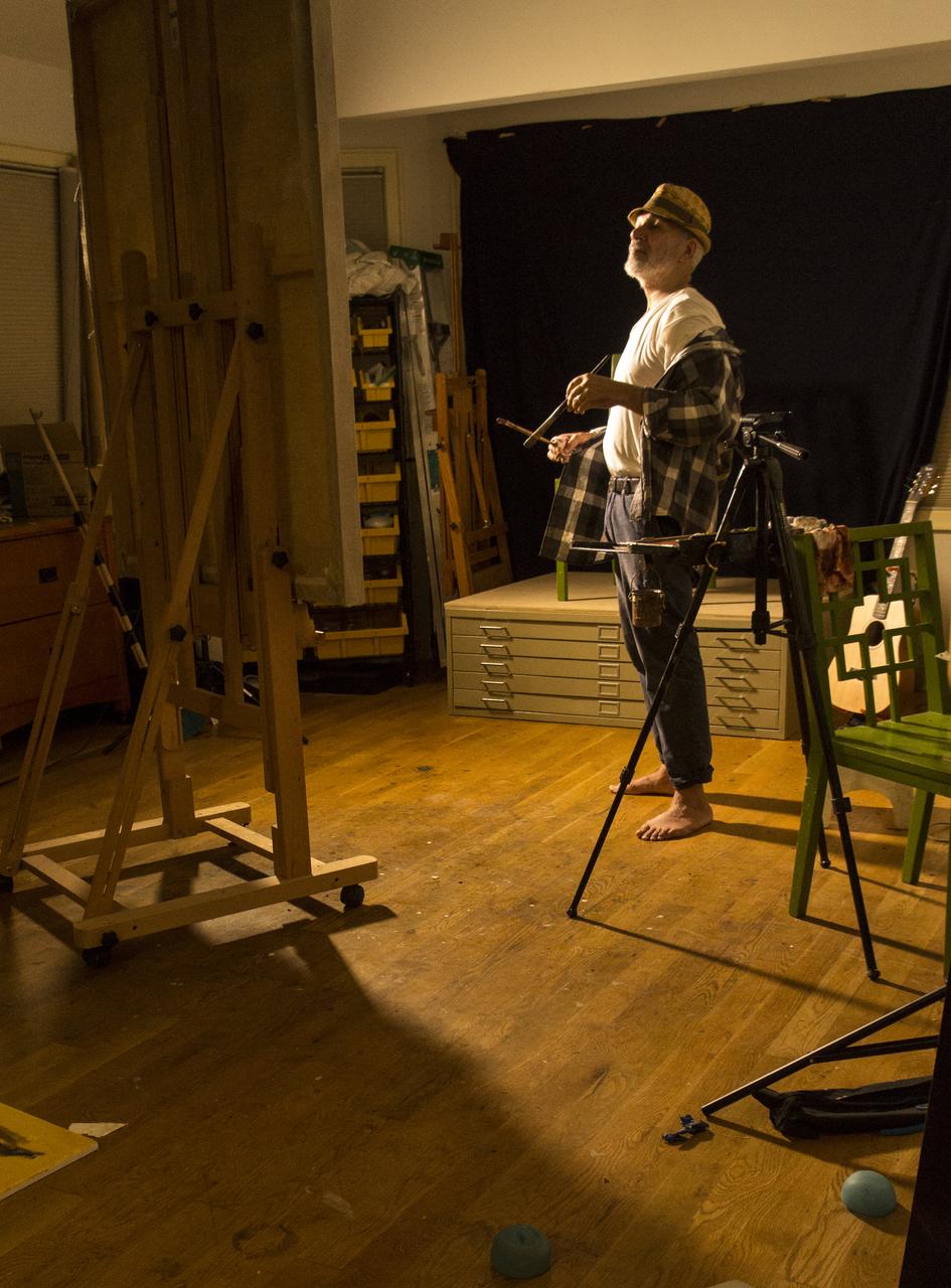
Solvent Free Process
Why Solvent Free
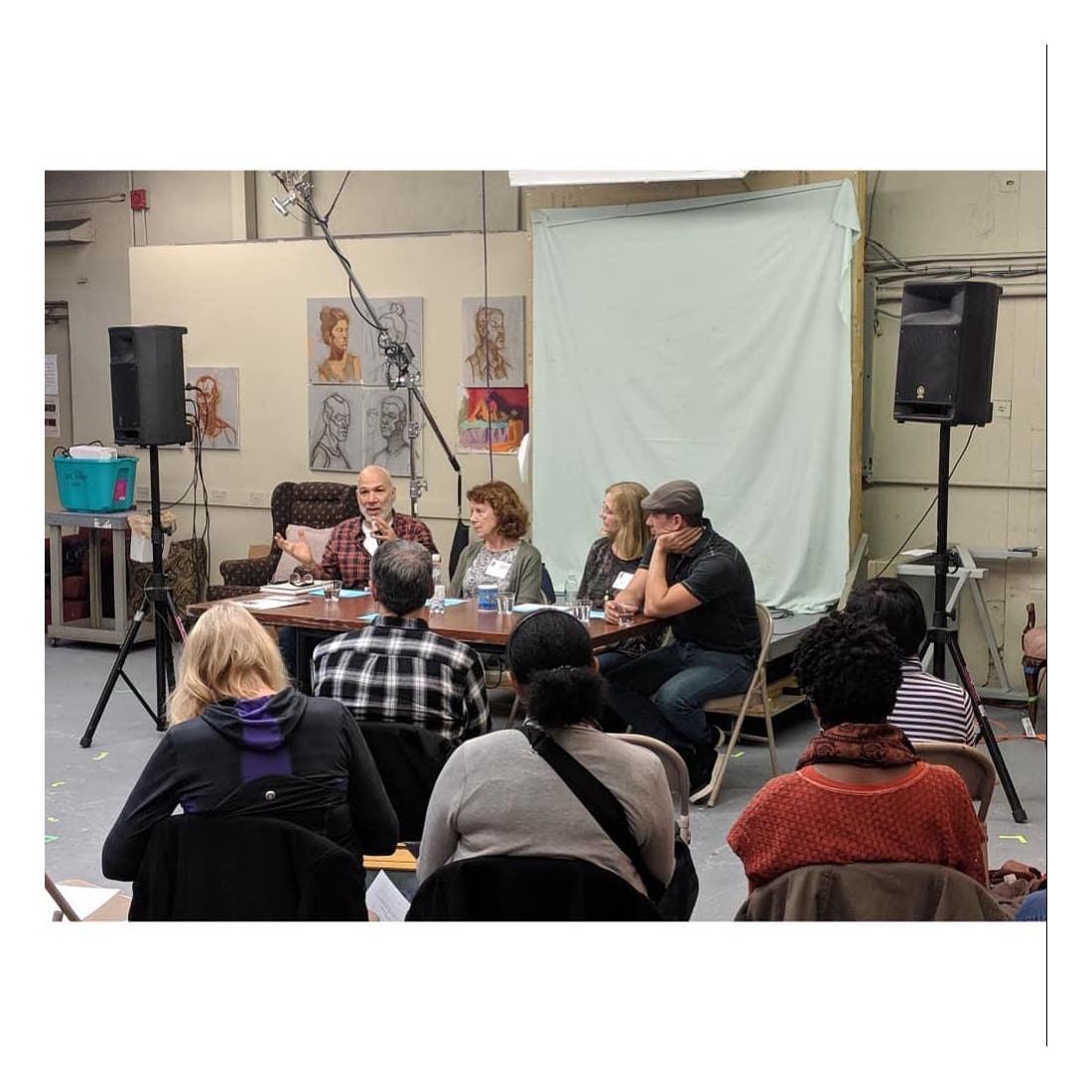
I get a lot of questions about my solvent free approach these days. So I decided to share this step by step regarding my process.
A few years ago, I started to get sick from the odorless mineral spirits and solvents. Even mediums with tiny bits of solvent in them made me sick. Three hours of painting with solvents would leave me bowled over with abdominal pain.
In desperation, I began to try different alternatives. My first idea was to use Spike Lavender oil as my solvent. It works well and does a good job. However it has a powerful aroma. One day, I had half a room walk out of a demo I was doing because they couldn't handle the odor. Then I painted at the open session at the Art Students League where the cranky hard headed elders in that group were on the verge of tar and feathering me before kicking me out of the room. The final spike was when the spike began to make me sick too.
Next, I tried water soluble oil paints. The problem with water soluble oils is that you can't use real bristle brushes because water makes them fluff up like cotton balls. I love bristles brushes and that was terrible blow for me. Also, water soluble oils are relatively new and their permanence is in dispute.
Finally I was about to give up on oils and make a switch to acrylics. I have painted with acrylics before, and it wasn't a bad experience, but the idea of painting with plastic forever, gave me a heartache. I was about to go out and buy some acrylics when I read an article about traditional painting practices. What I learned was that solvents used in oil painting are a relatively new practice that started in the mid 19th century or so.
It turns out that Rembrandt and his contemporaries simply used linseed oil, walnut oil, or safflower oil to clean their brushes between strokes and just let their brushes soak in the linseed oil when they weren't painting. If that's was good enough for Rembrandt, it was good enough for me.
It took me a while to figure out how to do this because I had previously been so enamored with the big washy blockins that solvents allow for. I finally realized that using the fresh paint and doing an almost dry brush block in works best for me. The initial blockin doesn't look as impressive as the big washy blockins I used to do when I used turpentine, but in many ways it's better because it's a more sound procedural practice when it comes to the permanence of your painting. That's important because I would like my work to survive at least longer than me.
Now, I no longer feel sick after painting. Best thing I've done is to go solvent free.
The Process
There are two different approaches that I use.
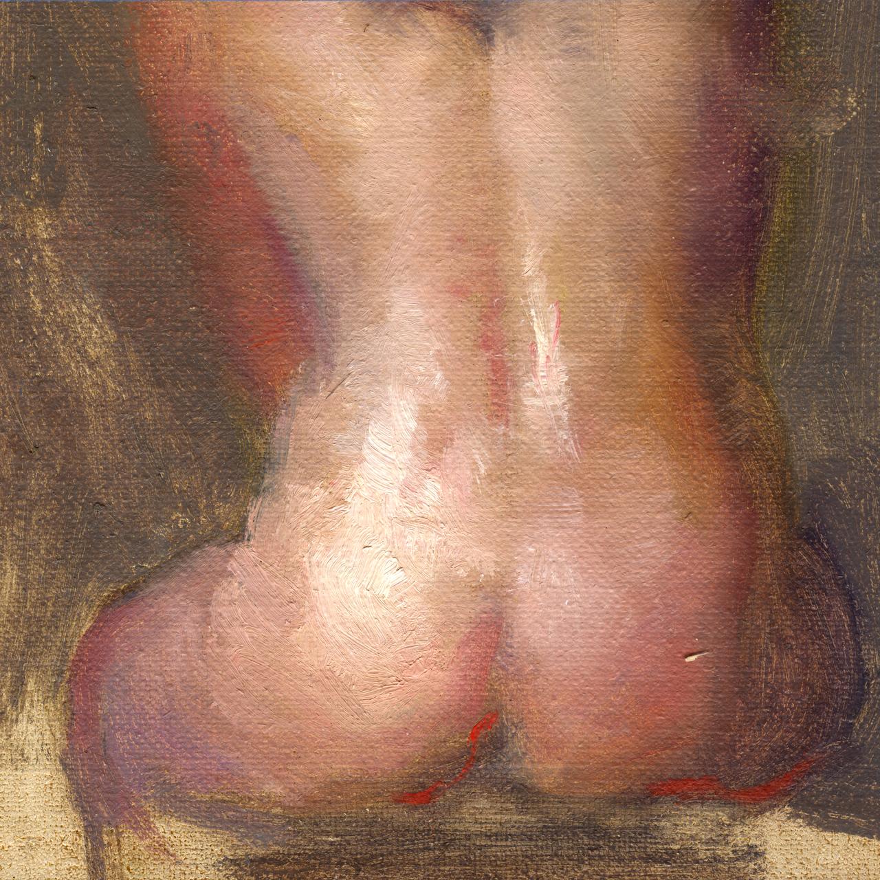
For small paintings and sketches, I start the block in with fresh paint. I apply it thinly and almost like a dry brush.
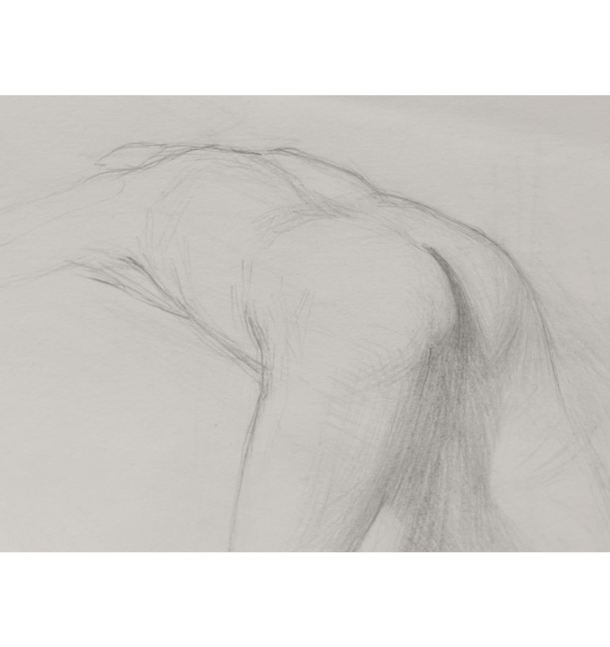
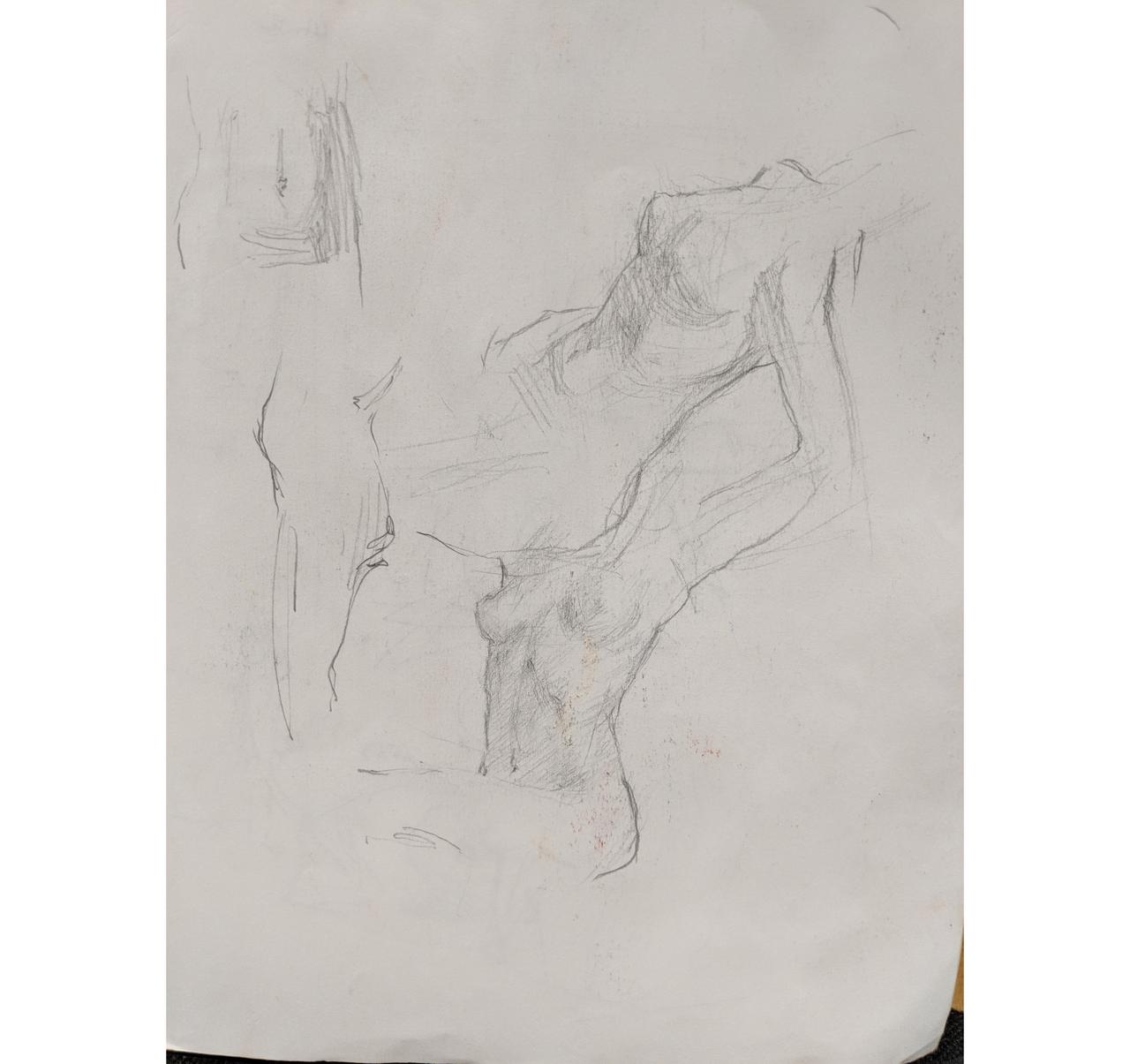
For larger more complex paintings I often start with soft vine charcoal and make my per-block in with charcoal. When everything is right, I lightly dust off the charcoal with a cheap hardware store chip brush leaving a ghost on the canvas. Then I proceed to do the dry brush application with fresh paint. This step by step is that process.
Materials
Before I start, I want to mention something about materials. In order to make this way of working easier, I usually work on oil primed board or linen. Recently I've discovered the wonders of Michael Harding's non-absorbent acrylic primer. It feels like oil primed, but without the hassles of oil priming.
The advantage of working with oil primer or the non-absorbent acrylic primer is that you are able to wipe away areas easily. This is of great advantage if you're the type that likes to think on the canvas.
I use soft vine charcoal for the pre-blockin. It's easy to change and to push around. I can wipe it off if I want to make changes or think. After the blockin with the charcoal, I dust it off with an inch wide cheap hardware store chip brush. I brush off the charcoal and leave a ghost that I then reinforce with a brush.
Step 1
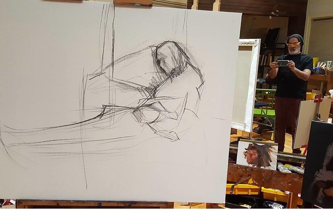
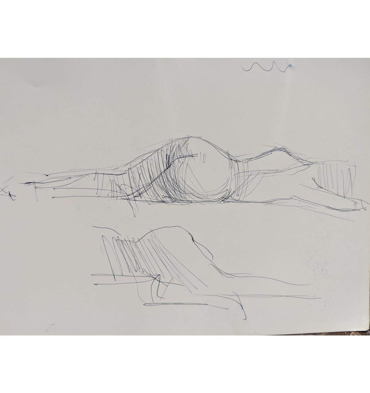
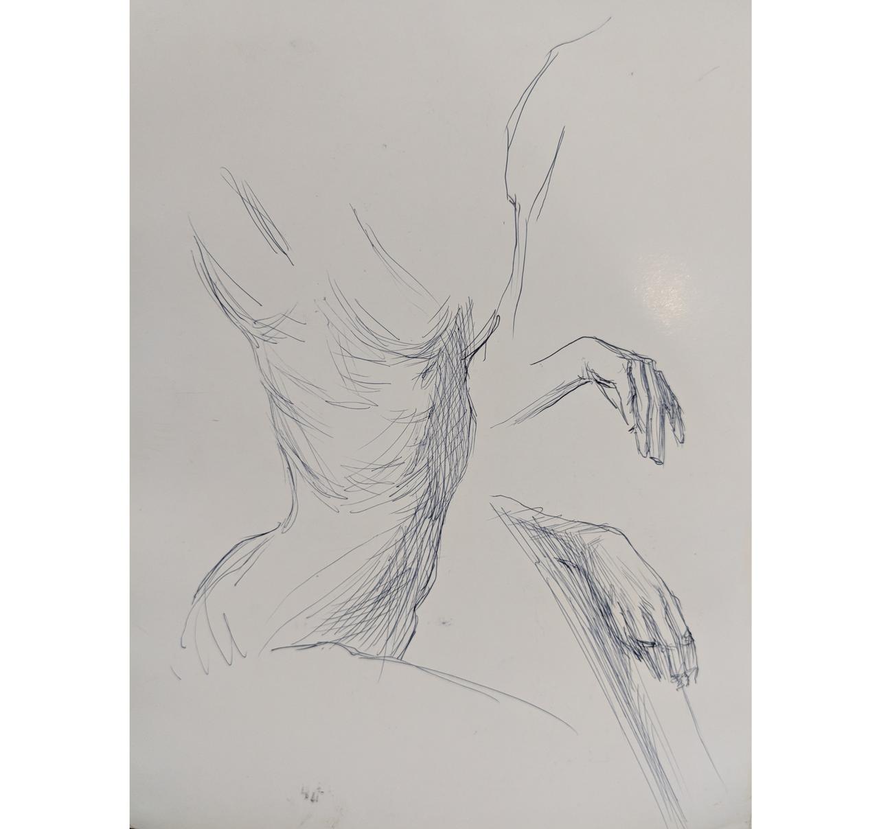
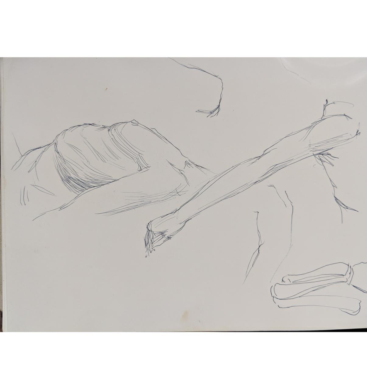
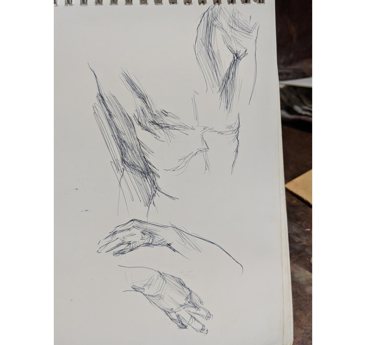
I start the underdrawing by finding the center of the canvas, then I carefully place the important elements where I want them. Mom's head and the baby placement was of utmost importance to me, so I carefully placed them where it felt right to me.
Step 2
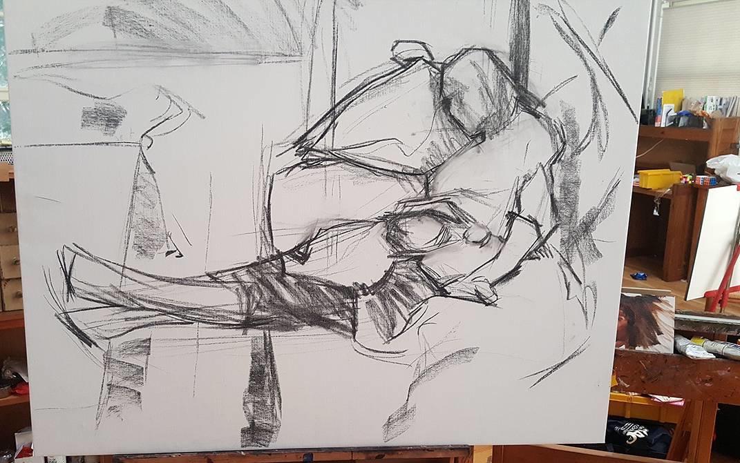
This is the finished block in with charcoal. All the major shapes are formed and story is clear. This is where I decide if I will proceed with the painting.
Having kids has taught me not to waste valuable time on a non-commissioned painting if I don't feel strongly about it. Lol, if it's a commissioned painting, I often have no choice and have to plow through it anyway. If it's a commissioned painting I would have worked it out in sketches and would have shown the client sketches before starting. On a side note, I always show the clients two or three sketches. They always pick my least favorite! Lol.
Step 3
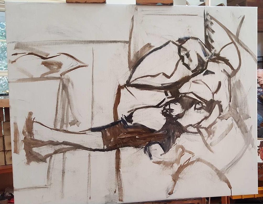
At this point, I take a big cheap chip brush from the hardware store and I lightly brush off the charcoal leaving a ghost image. Then I take an inexpensive bristle brush and I redraw the outlines with paint.
Step 4
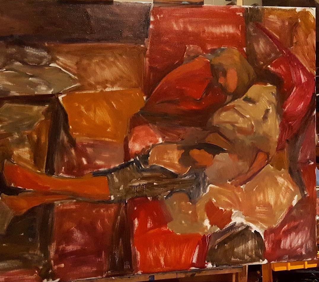
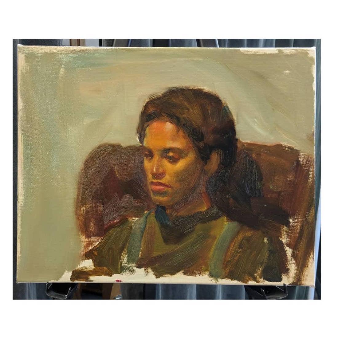
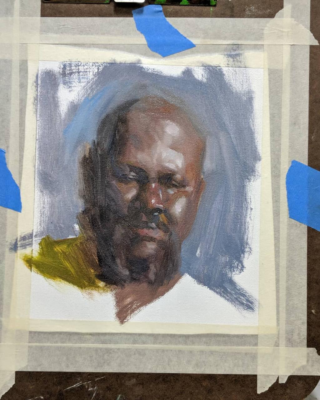
Starting with the focal point, I work my way out and begin to simply block out the drawing.
I block in the whole picture with a big dry brush. I use very little or no oil at this stage. I use a big brush because I don't want to fuss with details. A big brush makes me have to think about how to apply the paint. This is my first paint pass and my goal is to get rid of all the white and to have a clear understanding of the color harmony. I want to make sure that everything is in proportion and that the composition is clear. Though the detail isn't resolved, the proportions are.
I also want to make sure that the paint is thin because I don't want the underpainting to conflict with the next step.
At the end of this first pass, I once again assess if this painting is gonna be worth my time.
Step 5
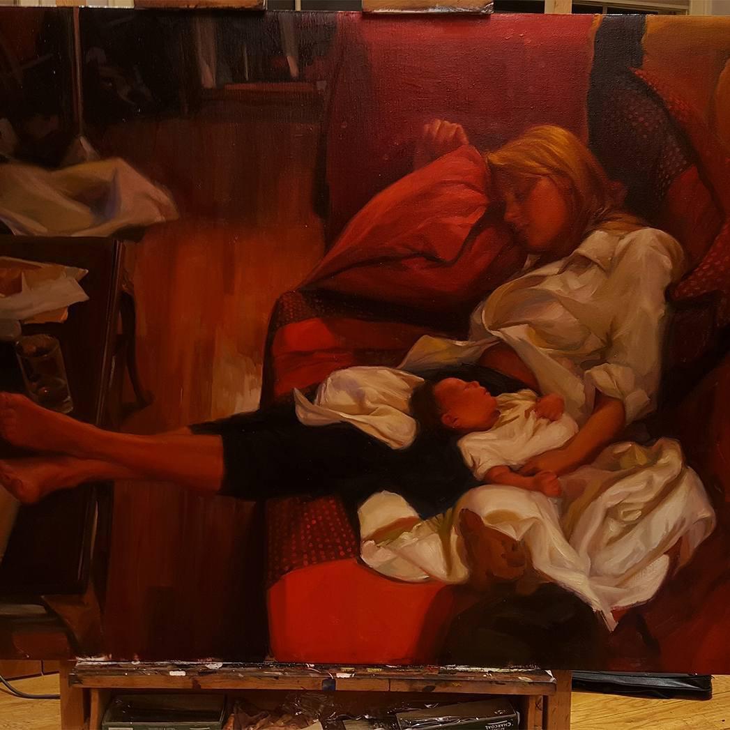
For the second paint pass, I begin to render bit by bit starting with the focal point or what I think is the most important area. The paint is mostly used as it comes out of the tube, but I will add oil to the paint where I want it to be more fluid. I may also use some oil in the dark areas to keep the paint thin there.
I don't jump around. I work from one area to the next resolving the painting to a high degree. I don't believe in having the same amount of detail everywhere and so this method of starting with the most important areas and then following the hierarchy of importance allows me feel better about leaving parts unfinished.
Step 6
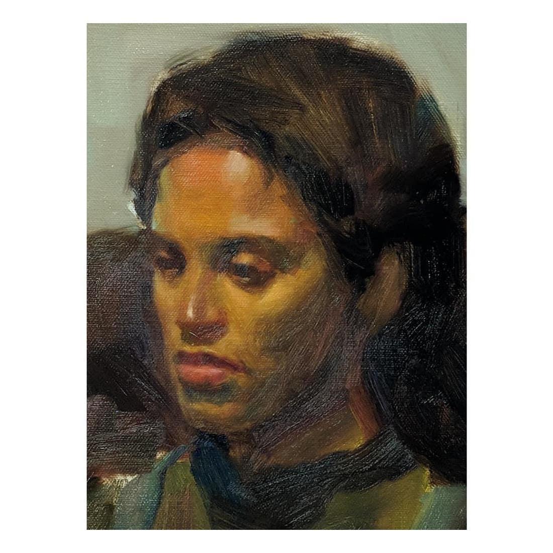
The third and final pass. I call it the beauty pass. This is where I make subtle changes. I use glazes and scumbling to pull the painting together. I add contrast with my glazes and do subtle touches of glazed or scumbled color in certain areas. Subtle details are tightened up in certain areas. I also take this time find areas to simplify.
At this stage, I'm using linseed oil with the paint to make glazes. If the glazes needs to be thin and subtle, or if the glaze starts beading up on the canvas, I add stand oil to the paint to create surface tension. If the glaze is going to be very thin, I add silica powder or chalk to the glaze in order to strengthen the bond of the glaze. If the linseed oil doesn't have enough particles in it, there will be adhesion problems in the future. If the linseed oil doesn't have paint particles or other particles to strengthen the linseed oil, it will sometimes buckle.
Chalk, talc, Silica powders are additives you can put into the mix to make particle to oil ratio better and to make the bond stronger. Chalk and silica become transparent in the oil and talc is good for adding body to an impasto. Rembrandt sometimes added ground lead glass to his glazes for effect. I haven't tried that, but I would like to someday.
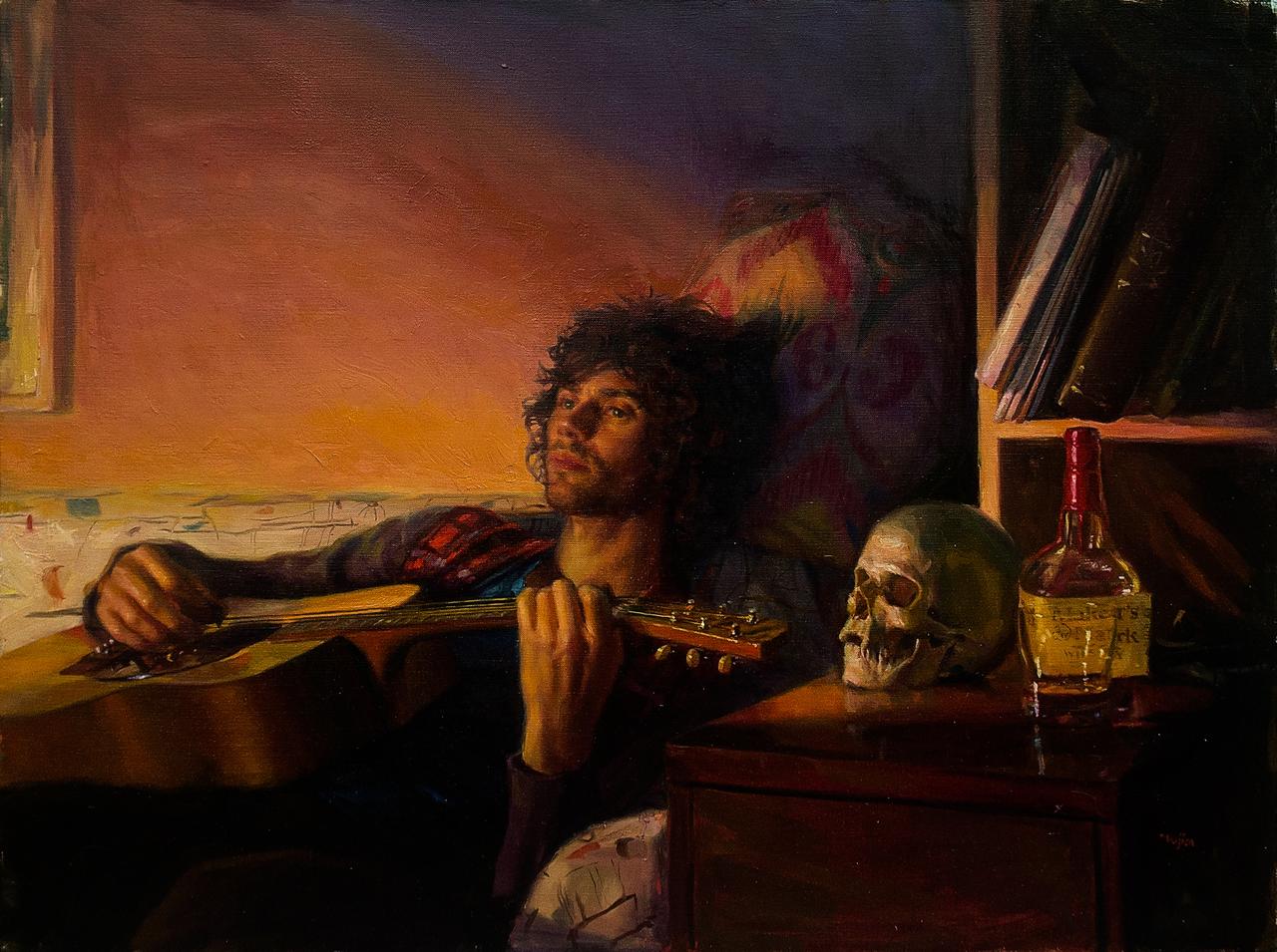
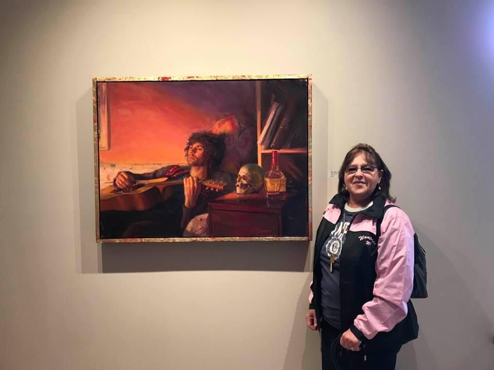
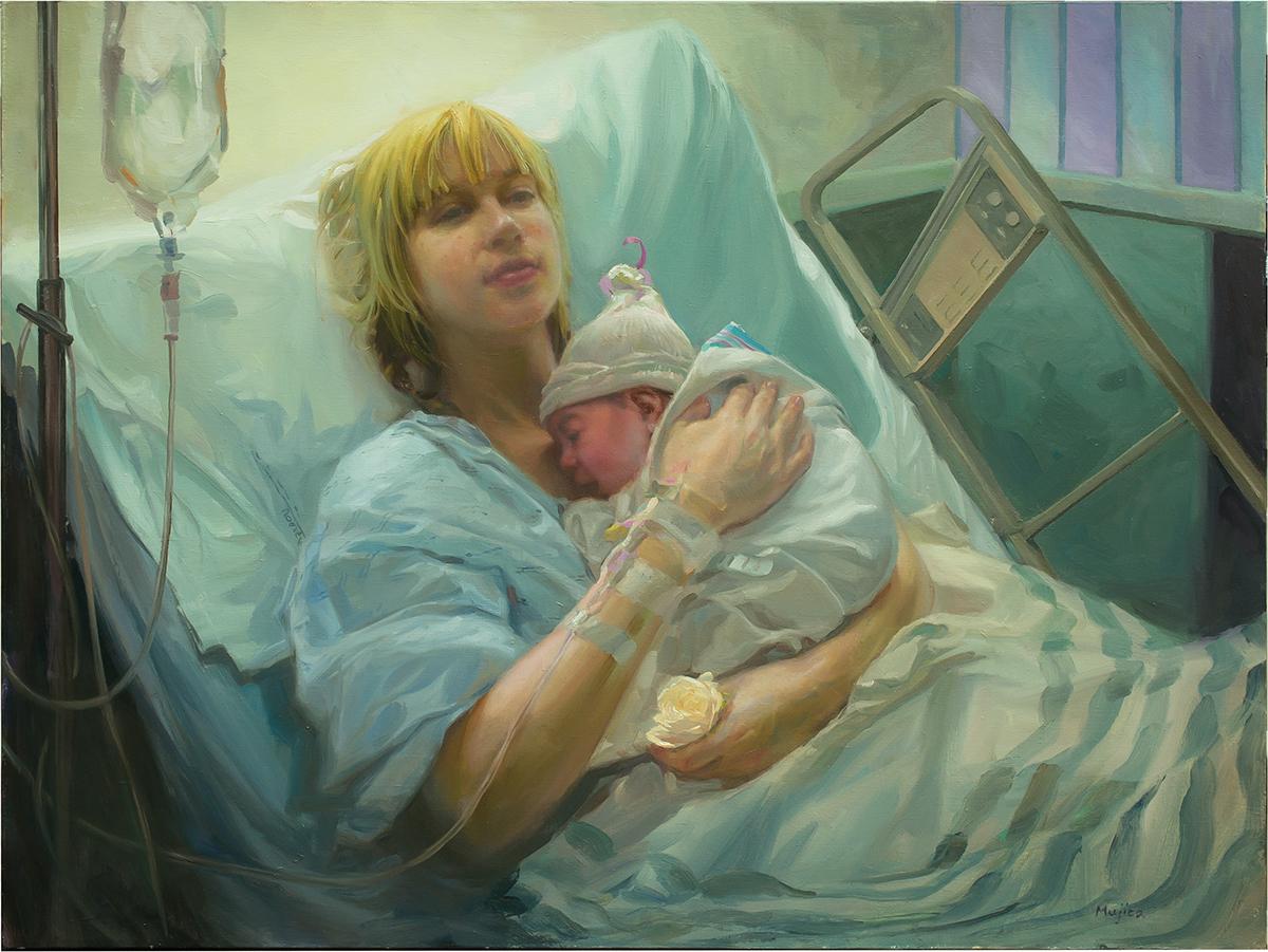
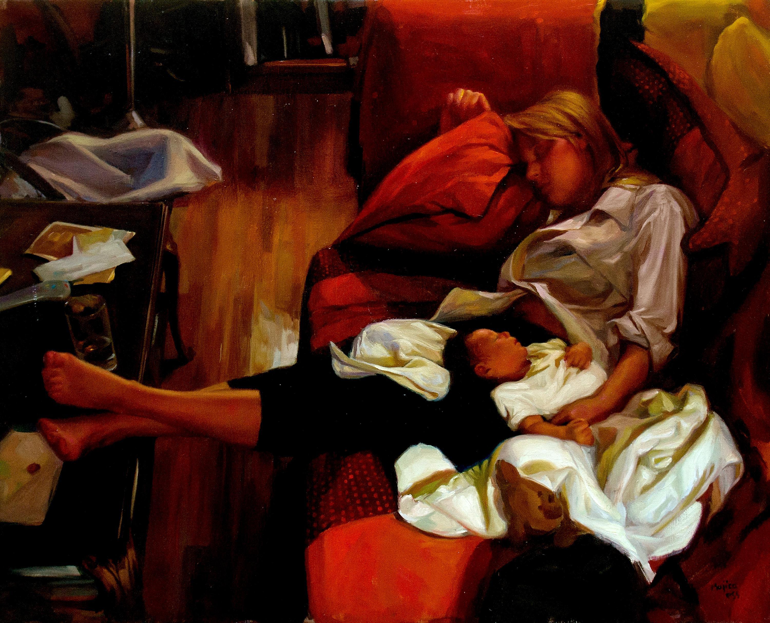
About This Painting
This painting has won several awards including the Lawrence & Lydia Miniter Award at The Ridgewood Art Institute Annual Juried Show. It was a finalist at Art Renewal Center Salon Competition, and it was on display at the Poets and Artists Show at the Arcadia Gallery in California.
The painting is about the journey into parenthood. The composition is carefully set up into ordered squares like a calendar that is interrupted by the sweeping of the figure across the grid. It signifies how having a child interrupts your life.
Mom is freshly home from the hospital and has fallen asleep in front of the TV. The baby car seat is still on the floor where it was left when we came home.
The painting isn't that deep, but it is very personal to me. My work is about life and the human condition. It's a theatrical type of realism that is influenced by my time on the stage as an actor.
The picture came about because on the day that we brought Violet, (my daughter), home from the hospital, I took a picture of her asleep on a pillow on the sofa. My wife and I were exhausted and she fell asleep on the sofa next to my daughter. I was tired too and didn't get a shot of that, but that image and that feeling of coming home with the first child, and being exhausted stayed on my mind for years. I wanted to capture the feeling of that day.
I came across the image of my daughter sleeping on the sofa years later and decided I wanted to recreate an image of that day and that experience around that little snapshot of my daughter. So I planned a painting and a photoshoot around that little snap shot of my daughter. I had my wife pose on the sofa in my studio as if she was asleep with my daughter. I put a doll on her lap for the purposes of matching the lighting of my daughter.
I planned the background shapes of the image and I put a baby car seat in the background, (the hospital won't let you take the baby home unless you have a car seat for the baby these days). The car seat was part of the story and I wanted to make sure it was in the painting.
I knew I wanted to make the composition into organized squares and my wife's body crossing those squares, disrupting the order in our lives. It was a germ of an idea that made it to the finish, though probably not that obvious.
I decided on a red color harmony and I borrowed a sofa from another picture I had of my wife laying on a red sofa. I used that for the design of the sofa and for the play of the red on my wife. I enhanced that redness and took artistic license to make the red even more overpowering. It didn't start that way, but as I was painting, I really began to feel the mood that the red was creating. So I allowed myself license to make the red stronger. I've had people criticize the so-called overpowering redness in the painting because they say it isn't real. But my goal isn't a strict reality. For me, a mood is more important that a journalistic literalness. How do we capture a mood?
While I was painting the image, I realized that there were things I didn't like about the photo of my wife and so I had my wife pose from life for some final touches and fixes.